FALL 2021 ONE ROOM CHALLENGE - HAUSMATTER INTERIORS - KITCHEN/DINING -WEEK 1
It’s time for the One Room Challenge! What is it you may ask? It’s a bi-annual event showcasing interior designers and guest participants. Each Wednesday and Thursday, the internet and social media are flooded with interior design inspiration, original ideas, encouragement, and motivation as designers create a room in just 8 weeks!
The Space
This go-round, I have decided to tackle the dining room.
But wait, there’s more…
Since this room is joined with my kitchen, I am doing that as well.
Dining Before:
This room has seen more looks that Madonna…but they were all kind of been pieced together with what I had on hand, or what I had time to accomplish. This time, I’m going all in!
What’s staying:
The picture moulding my husband made for me. This room is pretty much a box with short ceilings, so these really help to add some character. Sadly, the white walls weren’t doing much to accentuate them
the vinyl floors.
the mirrored sideboard (it’s so pretty and my large table has been hiding it all these years)
The Dining Room Plan
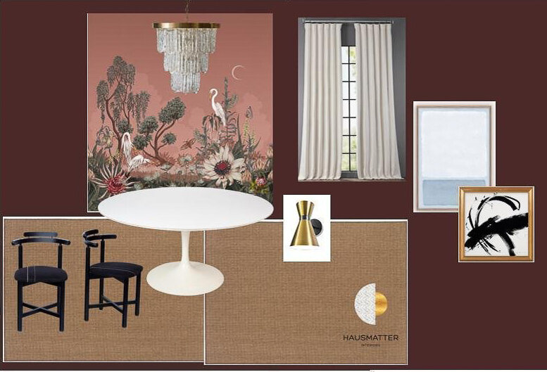
I know most people might not think of a dining room as a romantic space, but there is something so intimate about sharing a meal - a holiday - gathering with friends… So how about some mood?! I am going to bring in a round table to really encourage even more coziness. I also want more comfortable seating but may need to repaint the bentwoods I currently have if it’s not in the budget…
The vintage lucite chandelier, I’ve had in storage waiting for the right project. I need to see it in place before I sign off on it, but I think it could be spectacular. I really want to balance the modern and traditional in this room so the lighting will be a big player here.
Hausmatter Interiors One room challenge
This amazing mural from Hygge and West I chose in less than 5 minutes for the picture moulding. My designs usually start with a gut decision, and then the real challenge comes in figuring out the other details later. And this was no exception.
Did I just chose a giant red wall covering with life-sized birds on it??
Yes, I did.
moment of calm.
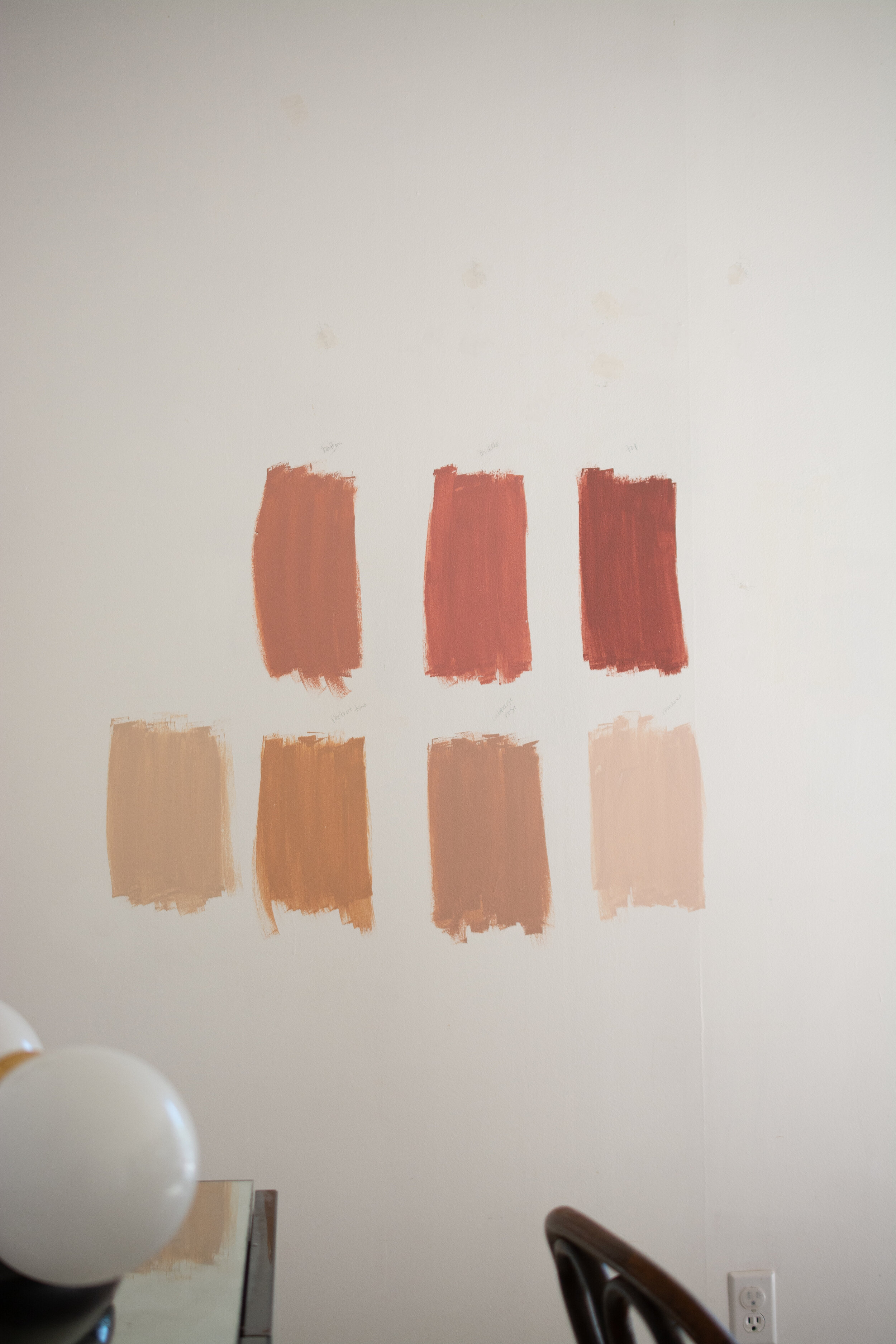
Once I let the gravity of this decision sink it, I actually got really excited. This is going to be so gorgeous! But scary. And risky. And all those things. I really struggled with the wall color to surround it, because I knew it needed to not only work with the mural, but the kitchen as well. Oi! I tested several pinks and mauves, but then quickly realized I was about to design the same room I did here and here. What can I say, I like pink.
testing pink paint samples on the wall
So I decided to challenge myself with a darker color. I chose a deep dark red, and I have to say, I am gobsmacked with this shade. It’s everything I want out of life, and more. It somehow manages to work as a neutral that can work in traditional and modern styles. Because it has a blue undertone, it rides the line between warm and cool. There isn’t a color I can throw at this hue that it doesn’t make look even better. More on this color here.
dark red paint color
The challenges ahead
As soon as the moulding went up, I realized we had a problem; that little alcove in the wall through everything off. You see, the moulding is centered to the back wall but the ceiling light is centered to the larger portion of that wall, so my light fixture has always been 6” off. I know! The shock. The horror. Only to a designer, right? I am going to come up with a solution to create a little eye-trickery and symmetry with the light/moulding situation.
Giving the floors new life with paint!
Installing the mural in picture moulding. I need to install it in a way that frames the ceiling light, and doesn’t cut off a birds head or something, haha!
Kitchen Before
This kitchen wasn’t bad before, but I have been craving more simplicity, and less stuff lately. Although this room is going to have a bolder, look, I am going to take this opportunity to reduce what we aren’t using, and organize it in a more functional way.
What’s staying:
The floors (same as dining)
The ceiling light
The appliances (unfortunately, with this being a rental, we can’t make changes to the layout and appliances)
The cabinets
the peninsula tile I installed three years ago - still love it!
possibly the counters, but not if I can convince my landlord to replace them. It’s due time!
The Kitchen Plan
Hausmatter Interiors One Room Challenge
I am going to play up the modern aspects of this midcentury kitchen, and the flat-front cabinets are going to work perfectly. It will be a nice balance to the elegance of the dining room. I am going to paint them the wall color so there is less visual clutter, and the focus can be on this stunning blush zellige from Riad Tile.
Riad Tile blush zellige
I plan to remove the upper cabinet above the sink and replace it with a large mirror. It’s so unexpected and will act as a “window” over the awkwardly-placed sink. Who wouldn’t want to see that mural twice?! Sconces from Ranor Lighting Design will flank either side of the mirror for more ambient lighting. Like always tell my clients, it’s nice to have the option for overhead AND mood lighting in every room - the kitchen is no exception!
Artfully walls is generously supplying the art for this space. I plan to make some bold moves here with some fun, graphic prints. It doesn’t need to match the mural, but I need to make sure my selections don’t clash with it.
To replace the antique cupboard I originally had on the peninsula, I am installing a wall shelving unit from Iron Works. This will be more in line with the modern direction and make the room feel a bit more open.
Hausmatter Interiors moodboard
The challenges ahead
Everything! haha, jk. Let me see if I can break this down to the biggest on the list:
installing the tiles myself (this will be a first)
Painting the cabinets (this is so much work! Usually takes 4-5 coats)
Storage and organization. This kitchen has no pantry, so the cabinets have to pull double duty! I really need to get smart with what stays, and how it is stored.
There is no range hood, only a very funny hole in the wall with a fan built in, LOL. It actually works really well though! Since I don’t use it all the time, I am going to use a piece of art to disquise it. I will need to create a box though as it protrudes off the wall. Also need to install it on hinges so it can open and close…
rewiring the sink light from the wall to the cabinets
Ummm…wish me luck?!
Left to do:
remove popcorn ceiling
paint walls
install mural
install dining lights
paint floor
order table and have plastic cut to protect the top
order chairs or repaint old chairs
order drapes and install
finalize dining room art selection
source styling accessories
check with landlord on countertop replacement
paint cabinets (a few need sanded)
fill in old hardware holes
paint new cabinet hardware
make art selections for kitchen
install tile
install wall sconces
figure out a way to hang the heavy mirror
create art box for range exhaust
customize the shelving unit and place order ASAP
Paint appliances??
Order rug and accessories for styling
In the words of Kevin McCalister’s Mom…I feel like I’m forgetting something.
It’s a lot this go round. I’m trying to stay ahead of it all so my family doesn’t want to disown me by week 8.
Also, I feel like I should note. Some of you might wonder why I put this much work into a rental? We go back and forth on buying it, but the truth is, I enjoy learning all these new things. I know I will put them to use one day when we own. I only invest my own money into things we can take with us later. Also, it keeps my portfolio fresh and gives me an opportunity to share small businesses I love!
Take a moment to visit my sponsors for this project
Although these items were gifted, they were entirely sourced and selected by me.
