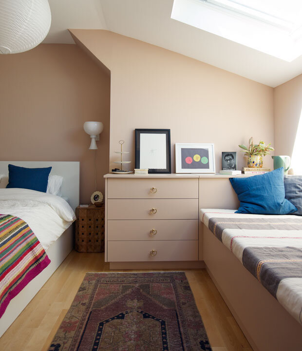
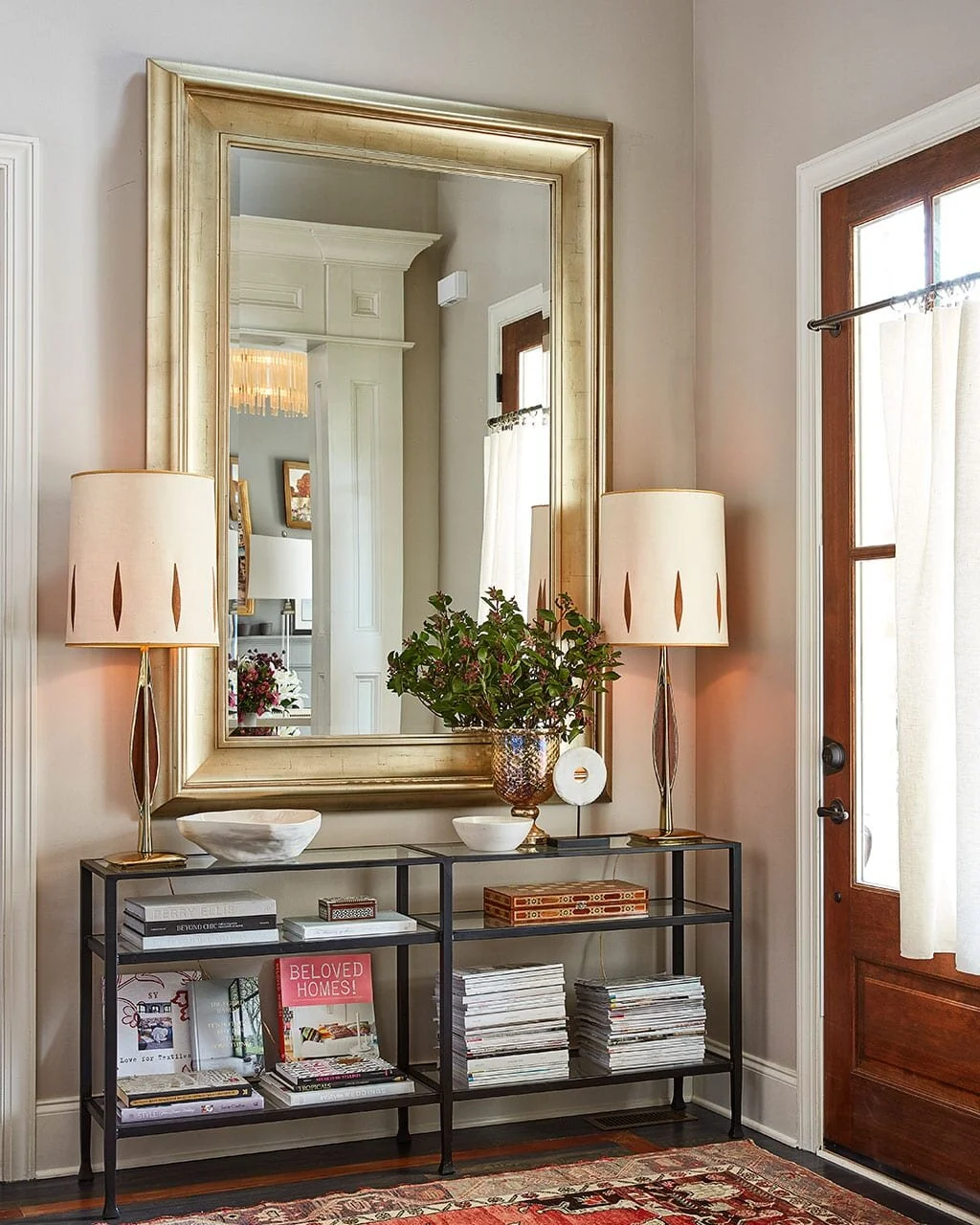
Not your average beige
Maybe beige is your comfort zone, or maybe, like me, you have a visceral reaction upon just hearing the word. I blame builder-grade homes of the 90s, and nearly every house I’ve ever rented. Not to mention, it’s most often seen in a repetitive-style Think: carpet to match, burgandy and yellow accent colors and oversized wall clock. There is the feeling that… if you use beige, you can only use it in this way. And it is tired. I’m with you.
Hashtags like #banthebeige with over 23,000 tags, are evident this is a color a lot of people feel very strongly against. If you are a millennial, you probably grew up with this color in your parent’s house. And since people tend to only replicate designs that skip a generation, it’s a color many choose to avoid. In this post, I’ll show you how to make this neutral feel nothing like that 90s home on your childhood culdesac.
beige Scandinavian Montessori nursery image source
So often, you see color lovers reach for whites to make their furnishings pop (which it does so well), but even with color, these rooms can feel cold. I’m here to show you how beige and color can look joined together! I’m also going to show you some colors that bend slightly out of the traditional beige we are all too familiar with. But even if that is a default color in your home, you will still find fresh ways to address it here.
Jessica Scott dining room using Restoration Hardware Flint SIlex image source
In the 2000s, gray quickly became the replacement for beige as the more “updated, modern” neutral. But you really have to be careful with gray, too, because if you are using it as a beige replacement, you are going to have the same problem; a vanilla room that feels flat and lifeless. Mark my words, gray walls will one day be viewed as “the dated color” for the same reason many of us find beige so repulsive. Don’t get me wrong, I love gray! But not if it’s used in the same way we so often see beige. You need color, contrast and texture to make any neutral come alive.
Nate Berkus Interiors beige built-in dining room image source
So Why beige?
It’s a neutral, which means it can look great paired with most colors (depending on undertones)
It’s going to hide marks well, making it great for homes with young kids (hence, why you see this color in rentals)
It’s a calming, soothing color, because It mimics the natural world. I’d argue even more so than blues and greens because it is a color than doesn’t demand much of our attention. It melds furniture in the room, blending them. This can also be why you get that “vanilla” quality to a room, so why added texture can be so important if you are avoiding color!!
It’s a great canvas for color. If you love to accessorize with color, but want more warmth and depth than white, beige is the perfect backdrop.
It’s a transitional color, meaning it can look great in traditional homes or more modern settings. Although this color get’s a bad wrap, it’s not going anywhere. It is timeless.
Beige is a complex color that can read gray, taupe, khaki, brown or pink depending on the undertones. It can meld or clash with other colors in the room, which is why it either feels harmonious, or just…so wrong. Below you will find some of my favorite beige, greige, taupes and tans!
How to make beige feel anything but boring
Try grasscloth: If you are hesitant to dip your toes into the beige waters for fear of it feeling lifeless or dated, a grasscloth is a great place to start! This wall covering can feel very modern and adds an earthy, textural element to a room, that feels so soothing.
Amber Interiors beige grasscloth bedroom image source
Hausmatter Interiors Grasscloth wallpaper in bedroom
Beata Heuman grasscloth bedroom image source
2. Look at pale, peaches and pinks with a brown undertone. These will work as a neutral but also bend towards color just a bit. And this shade compliments primary colors so well.
Georgetown Pink Beige Benjamin Moore
Kai Ethier bedroom in Georgetown Pink Beige by Benjamin Moore image source
Nate Berkus bedroom image source
3. Use modern furnishings and accessories. These take the repetitive rooms from the past, and turn them on their heads.
Clay beige benjamin moore image source
Brandon Schubert bedroom using elephants breath by Farrow and Ball image source
modern beige living room by Grey Deco Interiors image source
4. Look for a greige or warm taupe. These became wildly popular in the last decade as the “it” color. For good reason. They are a happy middle ground between beige and gray. You’ll find they tend to have a purple undertone that presents itself as more cool in north facing rooms but can change to warm in the light of day. The beige is still there, but it’s not as in-your-face. Baby steps, am I right?
Wheat Bread by Behr
Natalie Nassar foyer using wheat bread by Behr image source
Natalie Nassar’s living room using Wheat Bread by Behr image source
Elephants Breath by Farrow and Ball
Brandon Schubert bedroom using elephants breath by Farrow and Ball image source
elephants breath by farrow and ball image source
accessible beige by Sherwin Williams
Accessible beige by Sherwin Williams image source
Accessible beige by Sherwin Williams design by Jolene Smith Interiors bedroom image source
HGTV Dream home bedroom 2013 Accessible Beige by Sherwin Williams
Hausmatter Interiors
5. Add color!!! Yes, you can do that, and please do. And not just the primary colors, go for aquas, corals and vibrant greens for something unexpected. Look for a beige with yellow or green undertones if you are wanting to play with secondary colors
beige living room image source
greige and orange living room image source
Beige bedroom designed by Beata Heuman image source
Hausmatter Interiors Pashmina by Benjamin Moore
Shaker Beige by Benjamin Moore
Shaker beige benjamin moore living room image source
Yellow trim makes the undertones in this beige come alive!
beige living room with yellow trim image source
6. Consider other applications: cabinet doors, a stairwell, the front door. It might be just the right amount of warmth you’ve been craving.
beige scandinavian kitchen cabinets image source
Shitake Sherwin williams image source
Accessible beige in dining room image source
beige scandinavian kitchen cabinets image source
7. Use a beige with a green undertone, It’s easy on the eyes and will keep you away from walls that feel yellow or pink, which can be problematic with other colors in the room. Beige colors with green undertones will pair especially well with warm woods and whites. This color can really calm down red oak floors. It also works well with most beige carpets as some shades of beige can clash or even make them appear dirty!
Natalie Nassar’s bedroom using Jogging Path by Sherwin Williams image source
beige bathroom designed by Melissa Lindsay image source
Grant Beige Benjamin Moore
Grant Beige Benjamin Moore in living room image source
Grant beige by Benjamin Moore in living room image source
8. Add texture This is imperative if you are avoiding color. There are so many ways to layer different finishes that will create interest and add even more warmth. Nothing says cozy and comfort like a neutral, texture-filled room!
beige bedroom design by Danila Yonsini image source
Shaker Beige by Benjamin Moore entryway design by Jason Bell image source
beige Scandinavian bedroom with sheepskin rug on rattan furniture image source
living room design by Julie Howard in Benjamin Moore Cape Hatteras Sand image source
7. Add contrast: Black and white finishes have a way of commanding attention against a beige backdrop. Use on the lighting, and trim if you want to play up the drama!
beige hallway design by Rita Konig image source
beige Scandinavian modern dining room image source
Hausmatter interiors Pashmina by Benjamin Moore
beige Scandinavian bedroom image source
Need help finding just the right shade of beige for your house? I can help you select the best creamy beige that takes into account your lighting and fixed furnishings.
Choosing the right beige for your house


