DARK RED INSPIRATION -ONE ROOM CHALLENGE HAUSMATTER INTERIORS KITCHEN/DINING WEEK 4
It’s week 4 of the One Room Challenge and that means we are halfway to reveal day!
In cased you missed it, here’s previous updates:
This week’s progress is…not cute. And if I'm honest, there are a few things that are throwing me as I see them developing outside of the context of the greater room design. Waiting on furniture to arrive means seeing bits and pieces develop on their own, which can feel a little unsettling. If you have been following along in my instagram stories, you heard me wrestle with the chandelier. Seeing it in front of the mural alone, makes the room feel too fussy - too 80s nail salon. For sure, a light fixture this grand needs a ceiling medallion, so I’ve ordered that. But is it too shiny gold? Too plasticy? Or is it just right? These are the questions I’ve been asking myself. So many of you said it was perfect, but I just can’t help feeling something…is off. The lacquered brass makes this feel cheap to me. The shape, I love so I’ve thought about just spraying the entire thing white. But for the sake of vintage preservation, I don’t know if I can bring myself to cover the lucite. One of my followers brought up a great point to me - one I ironically, always share with my clients: wait until the rest of the room is finished, and see if you like it then. Unfortunately, I don’t quite have the luxury of time if I’m going to complete the room. But she’s right, so I am going to let it marinate with a couple of quick ideas up my sleeve to tweak later (if need be). Once the modern table and chairs are added, this should hopefully snap into place for me. I really liked it on the mood-board. Really, we probably should have waited to install it and this doubt would have been for nothing LOL.
lucite waterfall chandelier
So before I get to the ugly, I thought I would share some dark red/maroon rooms that are giving me sooo much moody inspiration!
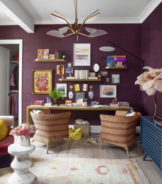
Love the relaxed vibe the grasscloth gives to this teen hangout/study.
Charlotte Luca home study area
This dark red and cobalt is so captivating. Burgandy really lends itself as a neutral to so many bold colors.
Jonathan Adler dining room
I am mesmerized by the wall application in this room.
dark red office source
High gloss = drama!
Celerie Kimble dining room
Who knew a microwave could look cute? And such an unexpected color pairing in this mini-kitchen. The painted ceiling makes this room feel extra cozy.
Rust/Terra Cotta kitchen with cabinet skirt source
Here, the dark red is used as an accent. It adds a richness to this blush, tonal kitchen.
Sarah Brown Interiors pink kitchen with dark red pantry source
Now for some ugly…
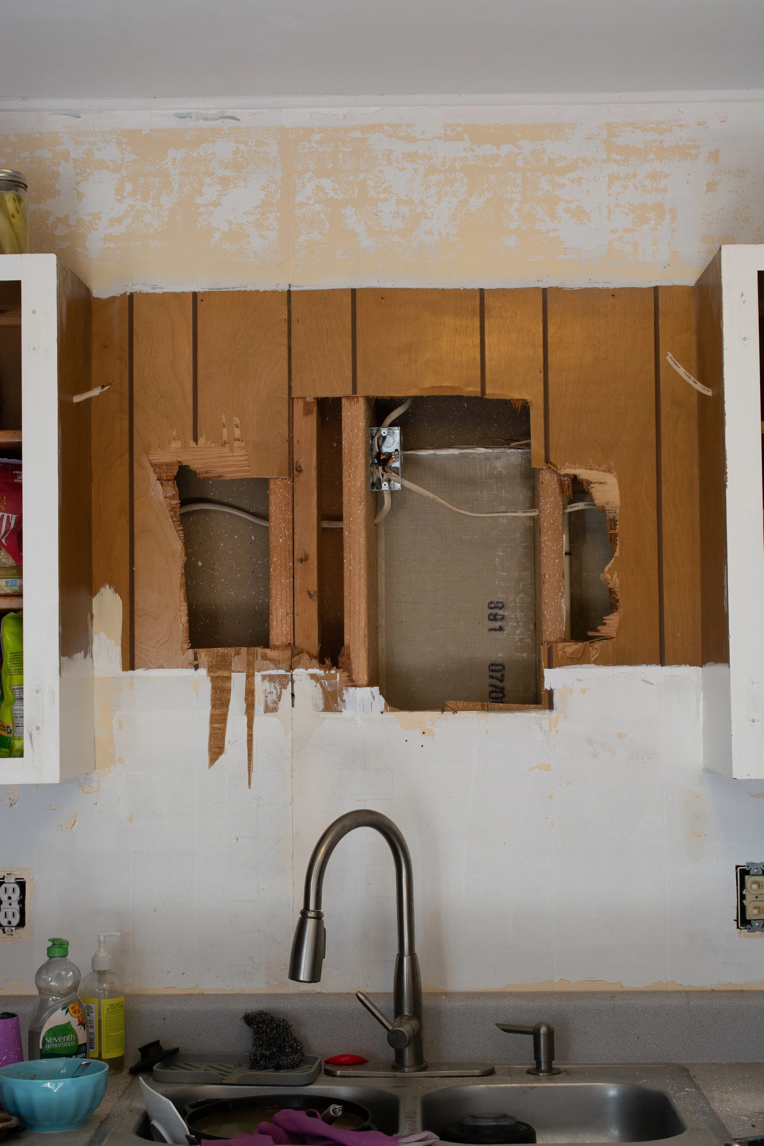
We removed the cabinet above the sink. There’s nothing like old paneling almost ripping your arm off to wake you up on a Saturday morning.
The sink originally had one light source located on the wall in the middle. We split the wires from this junction box and ran one on each side of the upper cabinets for the new sconces.
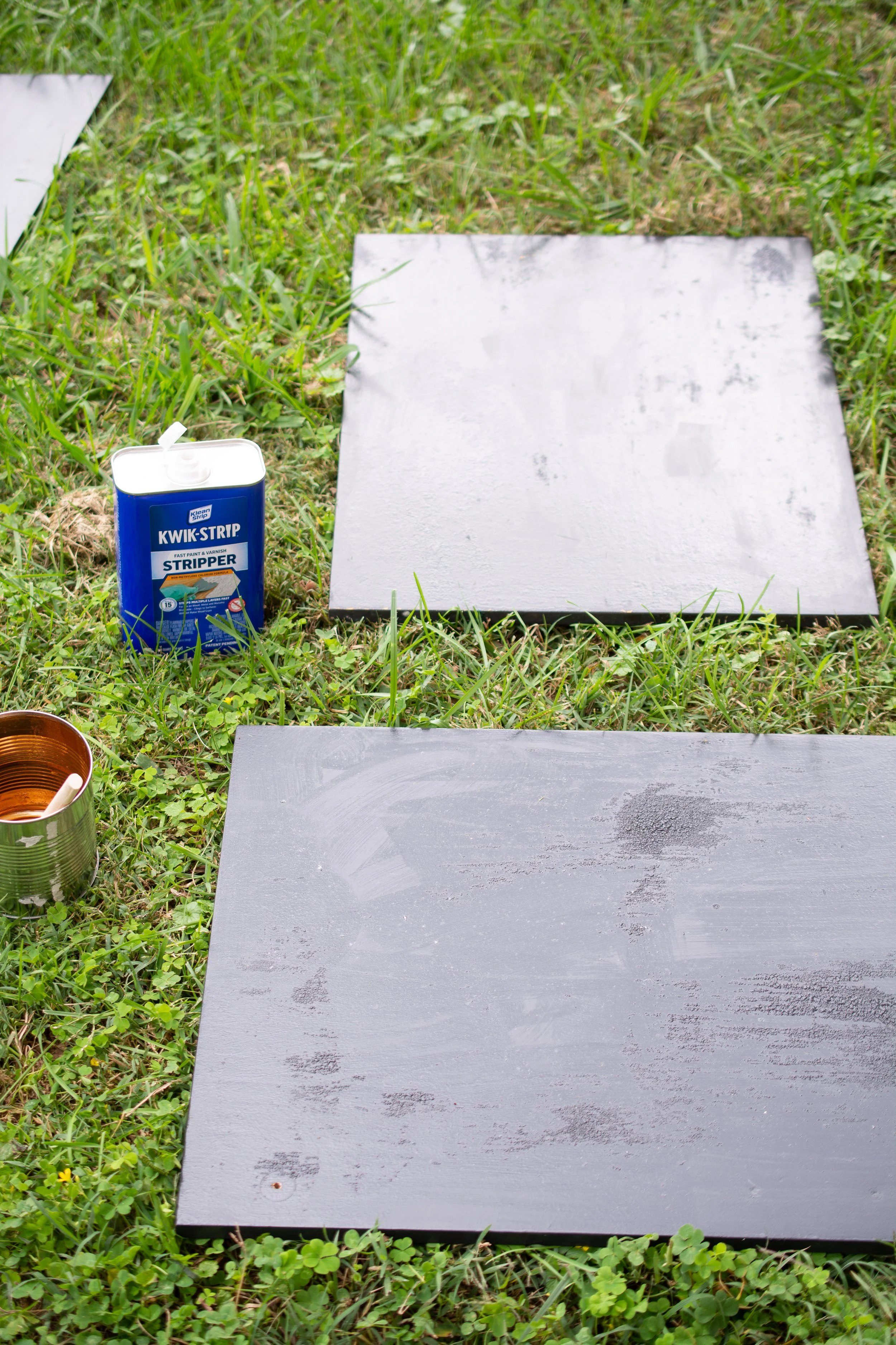
I then spent the better part of 24 hours a day stripping my cabinet doors. I initially used a paint stripper, which worked…okaaaay. It was a lot of scraping and more labor intensive than it needed to be, even when I left the product on the full length of time. Plus, I don’t like using smelly chemicals like this.
This was the result of my best effort at scraping, reapplying solvant, and then scraping again. I purchased a heavy duty scraper, but actually ended up preferring my kitchen dish scraper. Who knew?!
I then turned to the orbital sander with the highest grit and it tore through layers of varnish in a flash. Lesson learned for next time!
This week, I’m anxiously awaiting furnishings, countertops, the sink…you name it! Until then, I will be painting coat after coat of my beloved red onto the cabinets and doors…
Left to do:
remove popcorn ceiling
paint walls
install mural
install dining chandelier
paint floor
order table and have plastic cut to protect the top
order chairs or repaint old chairs
order drapes and install
finalize dining room art selection
source styling accessories
check with landlord on countertop replacement
strip cabinets
paint cabinets
fill in old hardware holes
paint new cabinet hardware
install hidden cabinet hinges
make art selections for kitchen
install tile
install kitchen wall sconces
figure out a way to hang the heavy mirror
create art box for range exhaust
customize the shelving unit and place order ASAP
Paint fridge
Order rug and accessories for styling
install art
convert sconce to plug-in for dining room
install new countertop
install new sink and faucet
install wall shelves
Please take a moment to visit my sponsors for this project


