The plan: A fun-filled, guest bath
Tomorrow, renovations begin on an outdated, guest bathroom and I am SO EXCITED!
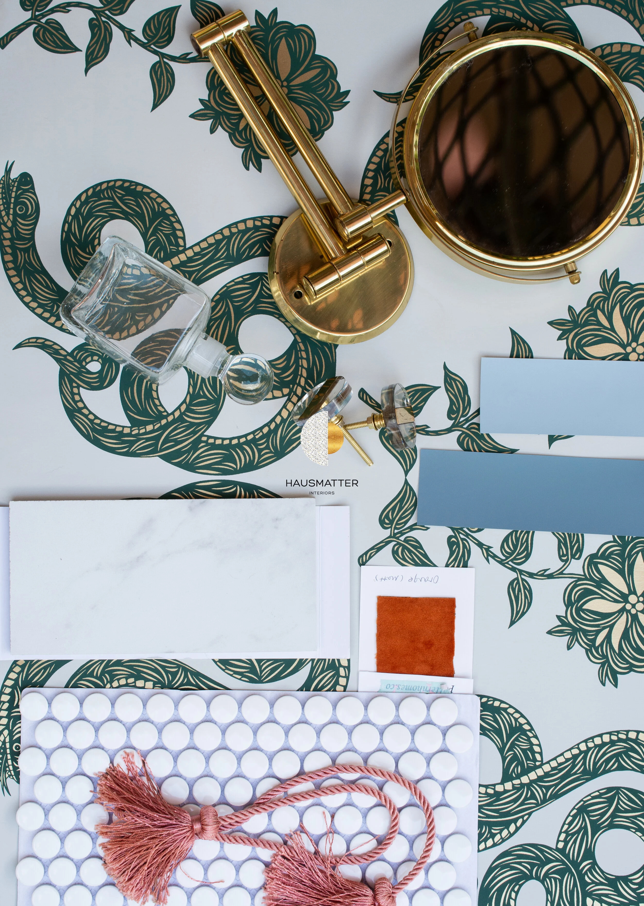
Life-sized snakes and flowers? Yes, please! The moment I saw this amazing paper by Hygge and West, I knew it would be perfect in this space. If ever there was a time for a bold, fun print, it’s in a bathroom! I chose the Juniper color way for this project for a few reasons: one, being that although this print is loud and proud, and doesn’t apologize, I wanted to keep the wall colors somewhat neutral in this room. The soft gray background and dark green will be a great canvas for pops of color later.
This pattern has a gorgeous golden sheen to it that’s so breathtaking in person! It’s definitely going to steal the show, so the decisions I make in the rest of the room will be somewhat restrained to keep the focus on this beautiful paper. I use the word “restrained” loosely here, because you know there will be some other fun moments as well ;)
It recently occurred to me that bathrooms might be my favorite rooms to design. It’s a room where a lot of big style choices get to be made, that come really close in proximity to each other, so patterns, colors and textures get to mingle in a glorious concoction of style-splendor. And, because its a room people don’t spend a ton of time in, I’m able to be a little more playful and push the envelope more than say, a living room or kitchen.
To keep the focus on the beautiful wallpaper, I will be using some transparent hardware like these lucite knobs.
I’m still making some decisions on trim and cabinet colors. I do like the way these blues look with the paper, so they will most likely find their way in (in some capacity)!
Let’s take a little peak at the before. If you remember from my last bathroom remodel, I am not afraid of an outdated room! BRING IT ON.
Before
One challenge I have had to overcome with this design is working around the shower tile. This tile/grout combo is not a choice I would have made, but it was put in recently, so for the sake of saving the homeowner money, I am going to work around it. Sometimes you have to make selections you DO like to coordinate with things you DON’T like. The end result may have you liking the undesirable choice! It’s all in how everything plays off each other.
So my floor tile choice will keep the wallpaper and shower tile in mind so everything flows seamlessly.
This medicine cabinet is filled with things that actually never get used. It’s funny how we hold on to things because we think we have to, just because they’re there, not necessarily because we need them. Replacing this light/mirror/medicine cabinet combo with a mirror and sconce will feel like a breath of fresh air.
The (obvious) organization issue in this room will also be tackled.
One original feature that I did find charming was the cabinet under the sink. I think it’s darling and my mind is whirling with ideas on how to play up its features.
List of things to do:
rip out all of the old hardware and fixtures
Select fabric for shower curtain.
paint trim (decide on color)
refinish cabinet (with a special surprise)
install wallpaper
install floor tile
install new light fixtures
source accessories
I can’t wait to see the finished room! This is going to be one for the books, for sure.
-Katherine


