Rental Kitchen Before and After
Welcome to my rental kitchen. Is it the kitchen of my dreams? Hardly. But with a little money, elbow grease and some permissions for our landlord, I was able to make it feel like ours.
During this process, I have become absolutely convinced you can have a kitchen that suits you, no matter the existing style, budget or circumstances.
rental kitchen makeover ideas
Before
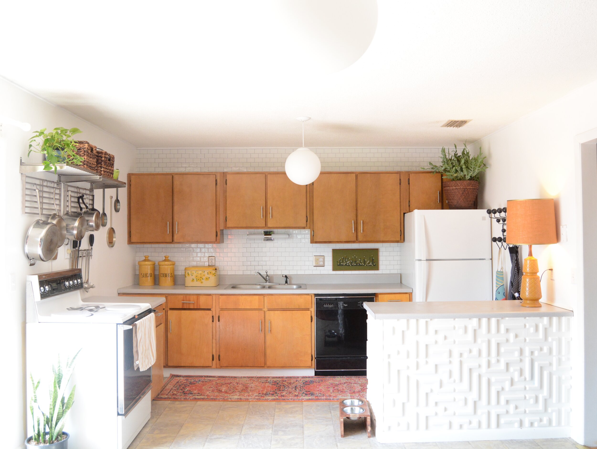
This photo is as embarrassing as the room itself. In my defense, we had just moved in days earlier and things were just…scattered everywhere LOL
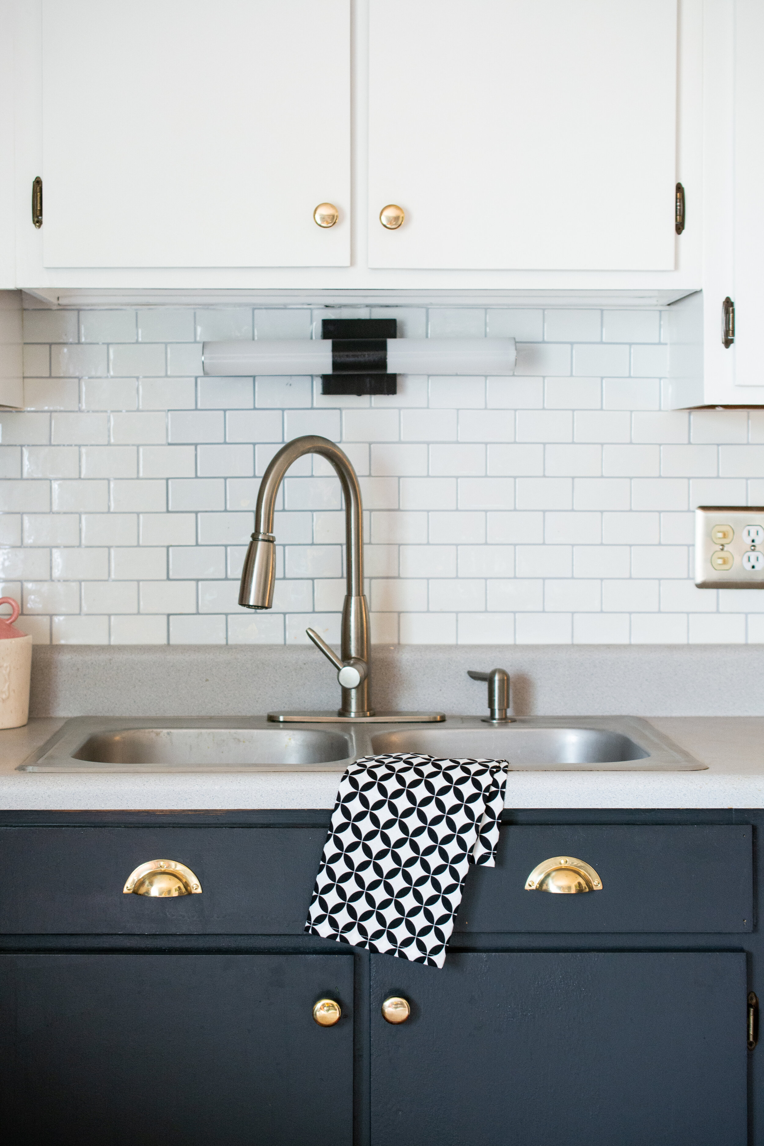
That bright light above the sink was a fluorescent bulb that hummed. To say it drove me crazy was an understatement. If fluorescent bulbs aren’t considered a form of torture to the senses, I don’t know what is.
The cabinets were great. Didn’t mind them at all, but Easter egg yellow walls is not a good match for warm wood cabinetry.
kitchen before and after
I initially swapped out the cabinet hardware and really played up the midcentury aspects of this kitchen. Taking it in a mid-century modern direction was the EASIEST way to makeover this space being that it was built in the 1970s. I am equally proud of the work I did here, but here’s the thing - it didn’t feel entirely me. I felt forced in this direction due to the fixtures and finishes I was working with.
I’ve heard it time and time again, “you should honor the time period of a home”. I don’t disagree, but I don’t like to draw any hard lines design-wise either. I think you can take a dated room in any direction you want if you blend design elements thoughtfully.
rental kitchen updates
My goal was never to take the midcentury out of this space. From the flat panel cabinets to the laminate countertops, this kitchen is midcentury AF. But MCM isn’t the only style I enjoy. I didn’t want to feel forced in one direction style-wise. I never design any other spaces that way, why here?
The materials I used in this kitchen makeover are not materials I would ever install in a new kitchen for a client. They are a mix of original fixtures and budget-friendly, temporary solutions.
rental kitchen updates
This post contains affiliate links, which means I make a small commission at no extra cost to you. See my full disclosure here.
Another strange thing was the fact the oven was floating in it’s own atmosphere apart from the rest of the kitchen galaxy. Why? And what is up with that vent?
This is a screenshot from my instagram stories. I forgot to take actual before photos of this space. Whoops!
Without a proper range hood, the oven/stove feels like an afterthought. Almost like I’m camping or something? LOL. My solution was to anchor it with this shelving system so that it felt like it belonged to the rest of the kitchen.
My intent was to inject this MCM kitchen with some other flavors. It didn’t need to make sense. It just needed to work.
So I incorporated some shaker and english traditional styles with the modern. I think this works here because these styles are pretty opposite each other. I find the juxtaposition interesting.
rental kitchen updates
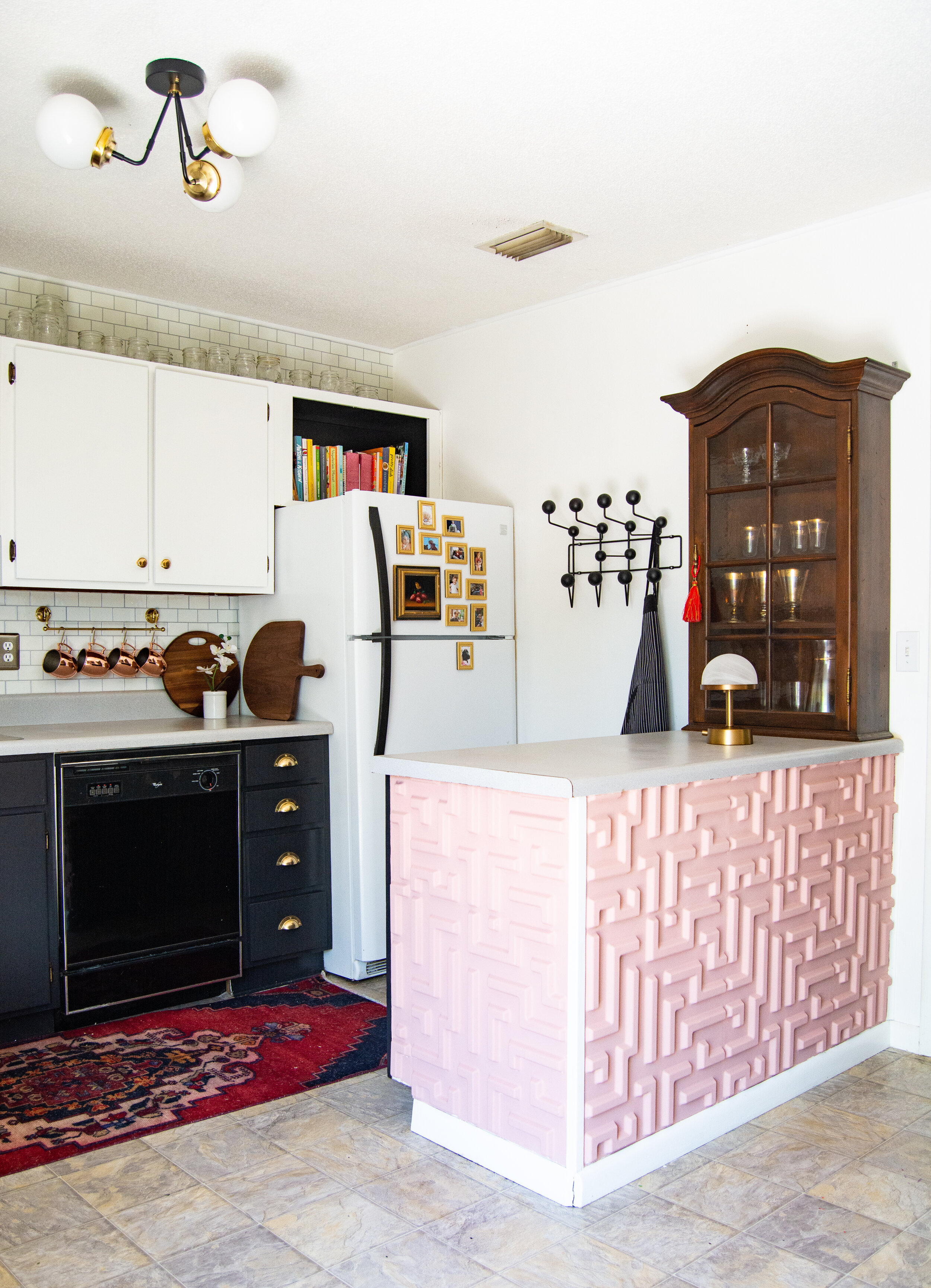
I thrifted this cabinet from a Salvation Army retail store. I absolutely LOVE IT. The tone of the wood. The lead glass. And it fits this peninsula perfectly.
kitchen produce storage ideas
Now I have a designated space for all of my specialty glassware.
antique cupboard for glassware
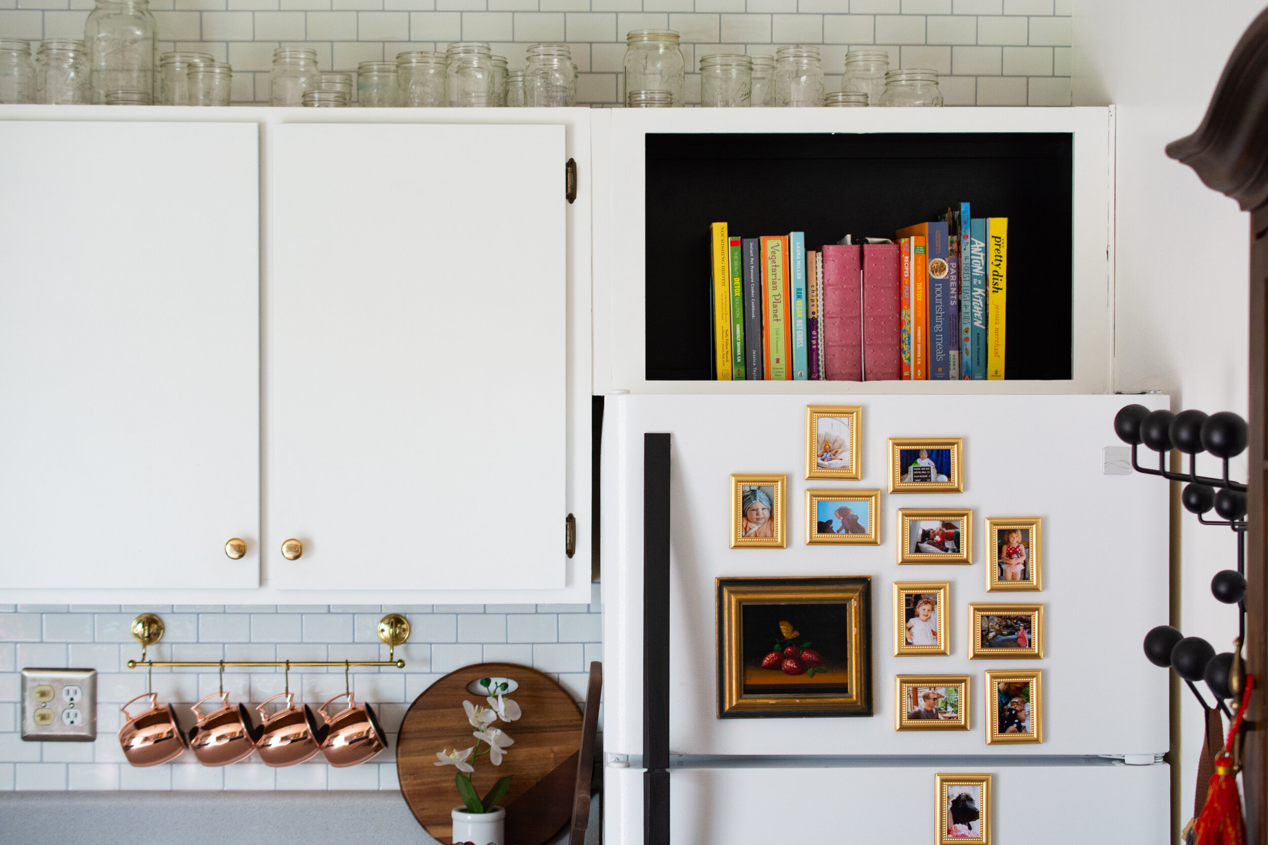
I decided to use the fridge as a way to connect the upper and lower cabinet colors. Painting the handle black makes it feel as intentional as the rest of the hardware in the room.
rental kitchen update ideas
I love cookbooks. I use them everyday. I thought it would be kind of neat to give them a moment above the fridge, so I removed the doors and painted the interior the base cabinet color. Now they really pop!
In case you missed it in my last post, you can find the fridge gallery wall tutorial here.
ways to update a rental kitchen
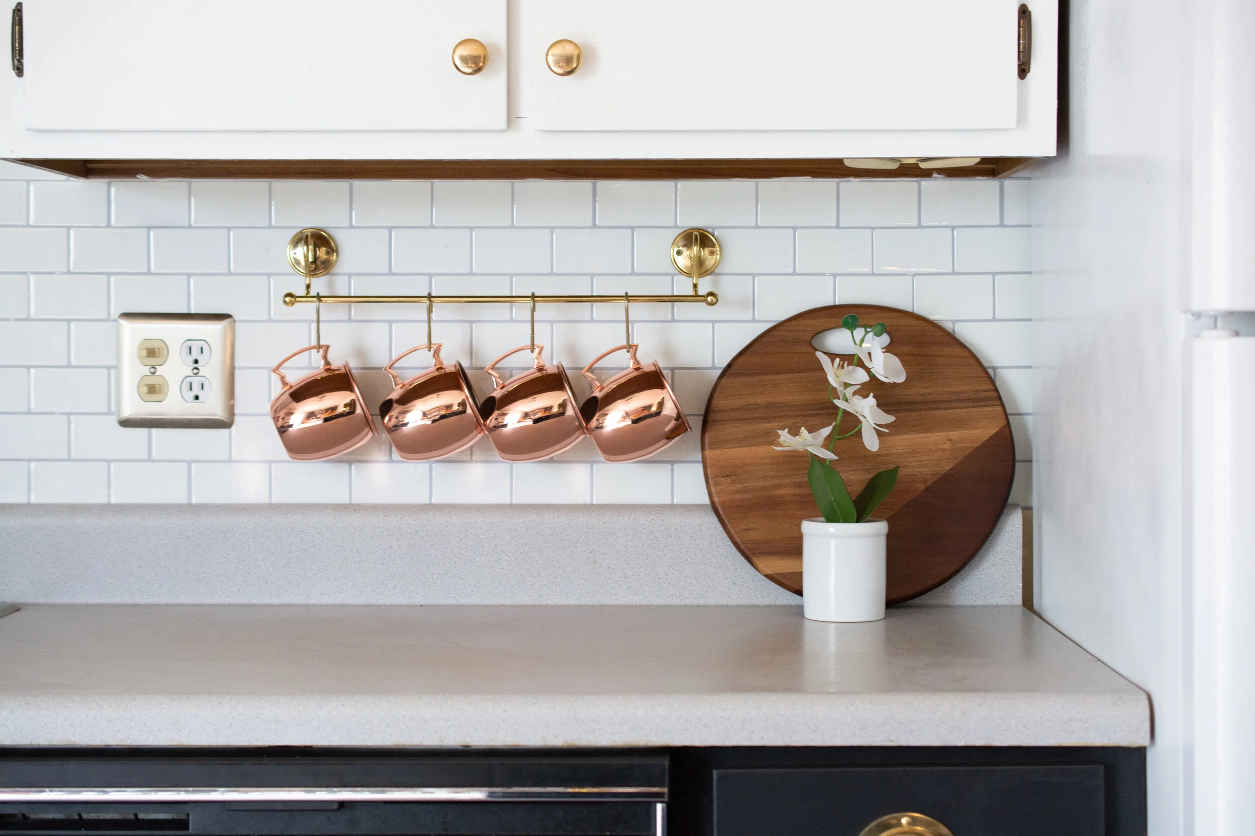
Here is my trick to bridging to opposing styles: There has to be a predominate element in the room that is neutral and timeless, style-wise. In this room, that is the subway tile on the wall. Is it overused in kitchens across the world? Yes, but there is a good reason why; It goes with nearly everything and does not have an overt style classification. It can feel modern or traditional depending on what’s around it. Think of it as the chameleon of tiles.
Speaking of tile, this backsplash is similar to what I used in my bathroom makeover. It’s a peel and stick, faux tile. Say wha!? Yep! I also applied it above the uppers to elongate the feeling of this 8 foot wall. Plus, it sort of takes on a French bistro feel which I love.
peel and stick backsplash
It really pained me to have to work around the existing laminate countertops and vinyl floors, but after I got over the less than ideal materials, I realized the color wasn’t awful. As in, it could be much worse. If I owned this kitchen, I’d probably use concrete or maybe even a black and white marble as a counter surface. I know there is contact paper and ways of painting and stenciling these areas, but we do not own this home. And something about covering a faux material with another faux material seems… counterproductive to me?
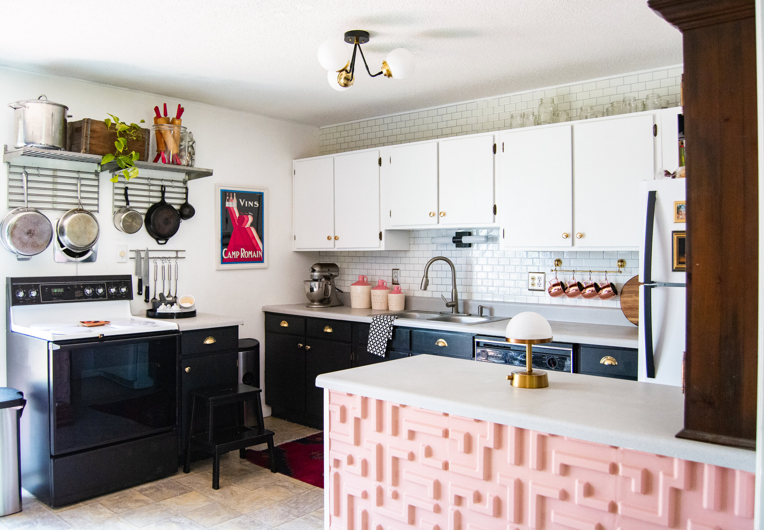
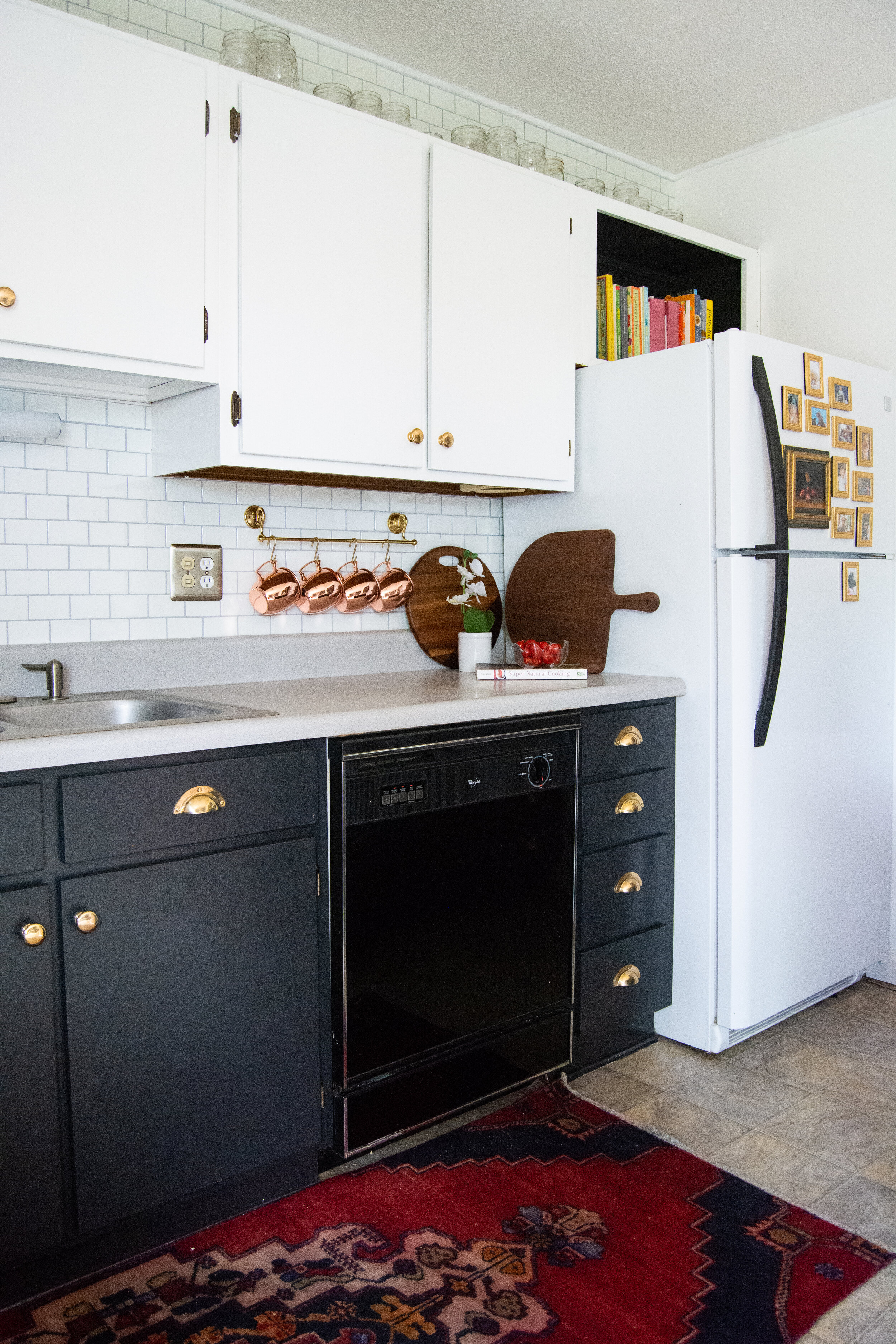
I determined white uppers and black lower cabinetry would best compliment the gray. I know some purists won’t understand painting over real wood cabinetry, but this was one of the original aspects that was limiting me the most style-wise. Painting the base cabinets black also helps disguise another element in the room that’s out of my control: the appliances.
The dishwasher no longer sticks out like a sore thumb but blends into the cabinetry.
peel and stick tile backsplash
For the floors, I purchased this gorgeous vintage red runner. Would you believe this was only $68 including shipping!?
ways to update a rental kitchen
I had fun accenting the contrast in the room with pink and red accessories. These rolling pins were such a sweet find!
ikea pots and pans storage
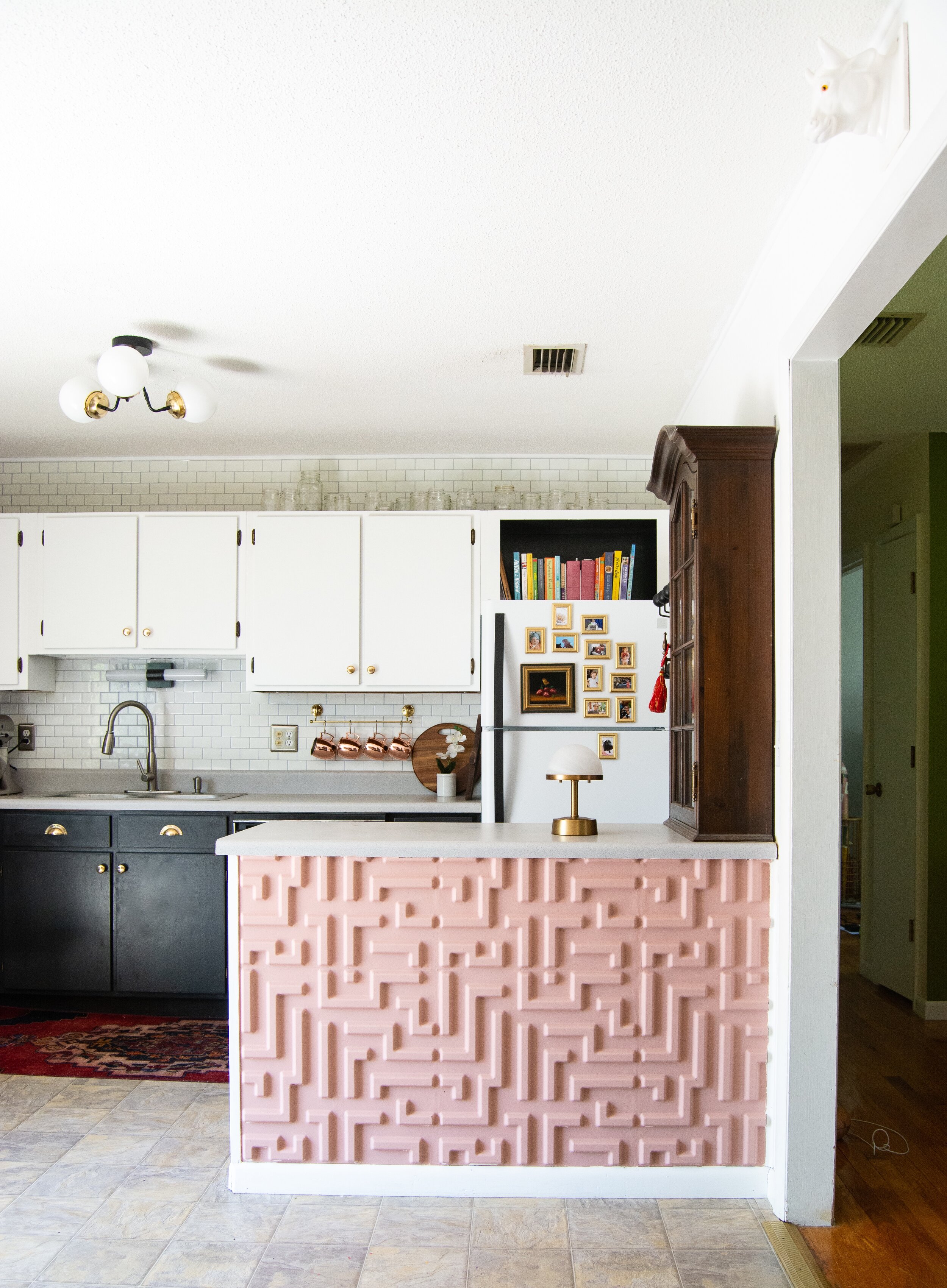
The original peninsula was a missed opportunity in this kitchen (hey, I found my beer!).
I decided to cover it in a 3D tile and give it a wash of pink. It’s a dusty rose color that compliments the grays in the room nicely.
ways to update a rental kitchen
I really love this product. It’s durable, paintable and made of plant fiber. It provides so much depth and interest to the space.
I wanna let you in on a little secret. I’ve thought about murdering this oven so my landlord would be forced to replace it. Is that bad? LOL
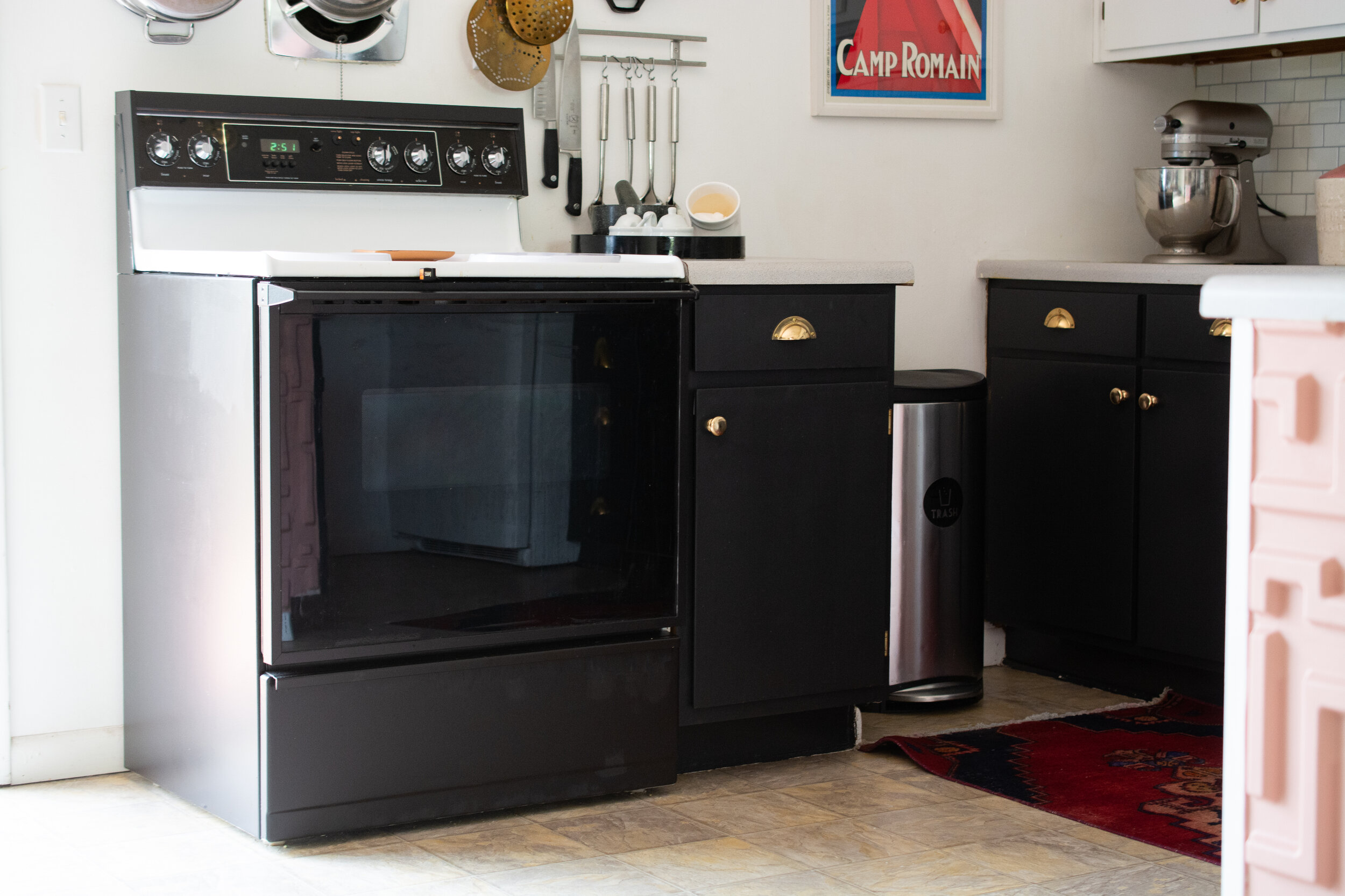
My conscience got the better of me and I opted for an oven refresh by painting it the cabinet color. Here’s the thing though, I NEED to be able to scrub all of the surfaces in here. This is why I’m not a fan of contact paper or anything else with seams. I don’t want to have to worry about food and things getting stuck in there.
how to paint an oven
So we painted the side, bottom drawers and all of the faux wood parts to match the cabinets. Watch it break now after all this effort. I die LOL!
old oven transformation
To compliment the English-style cabinet on the peninsula, I opted for shaker-style hardware. I searched and searched for polished, raw brass knobs which are becoming so hard to find. I am so glad I found Spearhead Collection. They specialize in vintage reproduction pieces that aren’t spray painted, plated or lacquered. They will actually patina overtime which I find so lovely.
peel and stick backsplash
Each piece is cast of solid brass and polished to a shiny finish.
unlacquered brass pulls
shaker style brass pulls
Ambient lighting is something we think about in nearly every other room in our homes. It’s a tricky thing to incorporate into kitchens though due to the electrical cords. Behold: Modern Lantern. They make cordless lighting solutions that are rechargeable.
kitchen accent lamp
We now have a soft lighting option for cozy nights playing cards or enjoying a nightcap. This single item has revolutionized how we use our kitchen.
kitchen accent lamp
Removing the fluorescent fixture on the ceiling was not easy, because it was anchored on all four corners into a popcorn-covered ceiling. I’m filing this one into the never-again category with the cabinets.
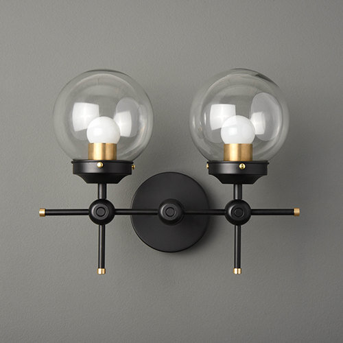
This light fixture from Illuminate Vintage makes all of it worthwhile though! At first glance, this light feels very modern, but it also reminds me of some of the very first light fixtures from the late 1800s which make it kind of a transitional style. Very cool!
modern kitchen ceiling light
And there you have it! For around $1,000 this kitchen has a fresh new feel.
ways to update a rental kitchen
Please take a moment to check out my sponsors!
