West Asheville Airbnb Reveal
Hospitality design is an absolute passion of mine. So, when I was hired to design an airbnb in the heart of West Asheville, I was thrilled!
west asheville airbnb design by Hausmatter Interiors
west asheville airbnb suite design
This particular client wanted a dual purpose space he would use as a therapy office during the week, and then airbnb on the weekends. After meeting with him and learning about his style and color preferences, I presented him with a masculine modern design that would please both his clients and guests.
hausmatter interiors moodboard
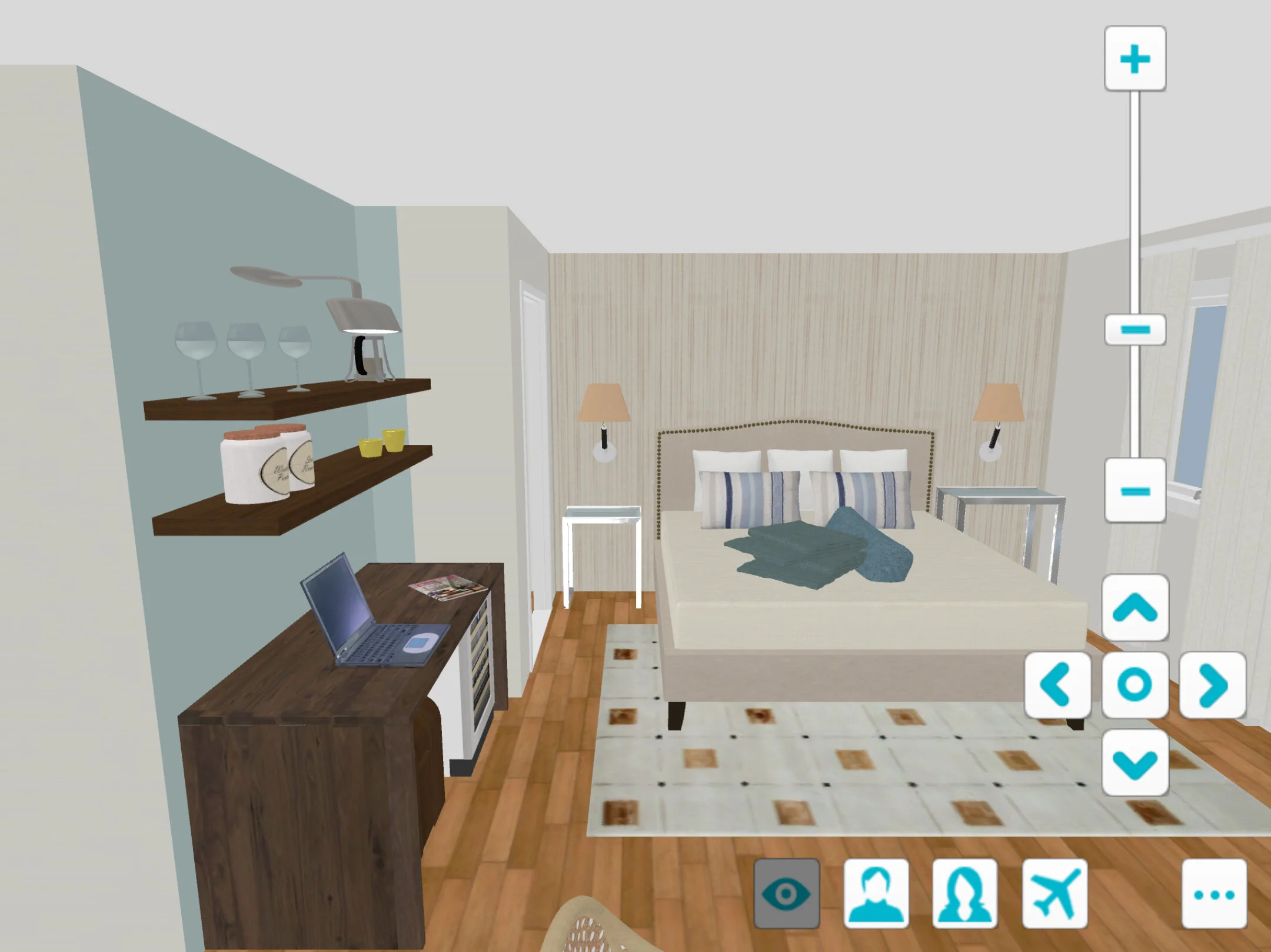
Along the four month process, I shared 3-dimensional renderings of the space with him so he could have a visual idea of what it would be like to walk through the space. The renderings don’t always include the actual finishes, but they give clients a feel for the layout. Once I have their approval, it’s time to implement the design!
3D bedroom renduring
Beige is not a color I typically use in my designs, but I felt like it was the perfect backdrop for these rich, pops of blue and green. Plus, it has a calming effect which I knew would be ideal for both uses of this room.
Asheville interior design by Hausmatter interiors
Part of the reason neutral rooms can feel drab quickly is due to the lack of texture, so I decided to have the back wall covered in grasscloth wallpaper. Not only does it add a textural element, but it also helps define the space as separate from the rest of the open unit.
Since kitchens are not currently allowed in airbnbs within the Asheville city limits, I opted for a beverage station in this design. It serves as a place to store coffee, tea and a refrigerator. I worked with the contractor closely to make sure the station could also serve as a place for someone to sit, have a cup of coffee, check an email, or enjoy some take-out. Since there wasn’t room for a dining table in the unit, this was an important feature in the room.
Asheville North Carolina interior design
Organic, fresh pressed coffee and an assortment of tea.
west asheville airbnb
One of my favorite things about hospitality design is thinking about all of the little details that make guests feel taken care of.
interior design and staging in asheville north carolina
west asheville airbnb
west asheville airbnb
My client was on a tight budget for this project, so I encouraged him to splurge on lighting and bedding, and opt for low cost options in other areas. There is nothing more important than a comfortable, stylish bed when it comes to hospitality. Organic sheets, down feather pillows, and genuine leather bolsters add to this rooms sense of luxury.
west asheville airbnb design
With little room on the walls for art, I encouraged my client to go with statement lighting for the sconces. These shaded, brass lights serve a function, and also make a gorgeous statement in the room. Opting for sconces over table lamps also frees up much needed surface space in such a small room.
asheville north carolina interior design
Once all of the installations were complete, styling day arrived. It’s always so fun to see designs come to life.
interior design and staging in asheville north carolina
The room looked great before styling, but it was brought to life with vintage accessories.
It’s not uncommon to see me styling with one hand and holding a camera with the other!
interior designer in asheville north carolina
Accessories usually involve a mix of what I bring in and what the client already has. This bar has a collection of my client’s favorite books, necessary items for beverages, a place to store used coffee grounds etc.; I try to think of everything a guest could possibly need.
west asheville airbnb designer
Spontaneous fun sometimes makes the best accessories!
I enjoy collecting antiques. Sometimes I purchase them without having a design in mind. This drawing was one of those pieces. I brought it on styling day, my client loved it, and it is meant to be here!
asheville airbnb interior design
Perfection is not possible, but I sure try to get close before the room is photographed!
interior design and staging
The sitting area of the suite was a mix of items my client already owned that he wanted me to incorporate into the space. The floor lamp, chair and futon just needed a little refinishing, and they were golden. Because there is such a mix of styles here, I decided to take this space in a more relaxed, bohemian direction. With the money we saved on reusing some of his pieces, we were able to splurge on a wool rug, designer pillows, coffee and end tables, as well as a textural art piece.
asheville interior design and staging
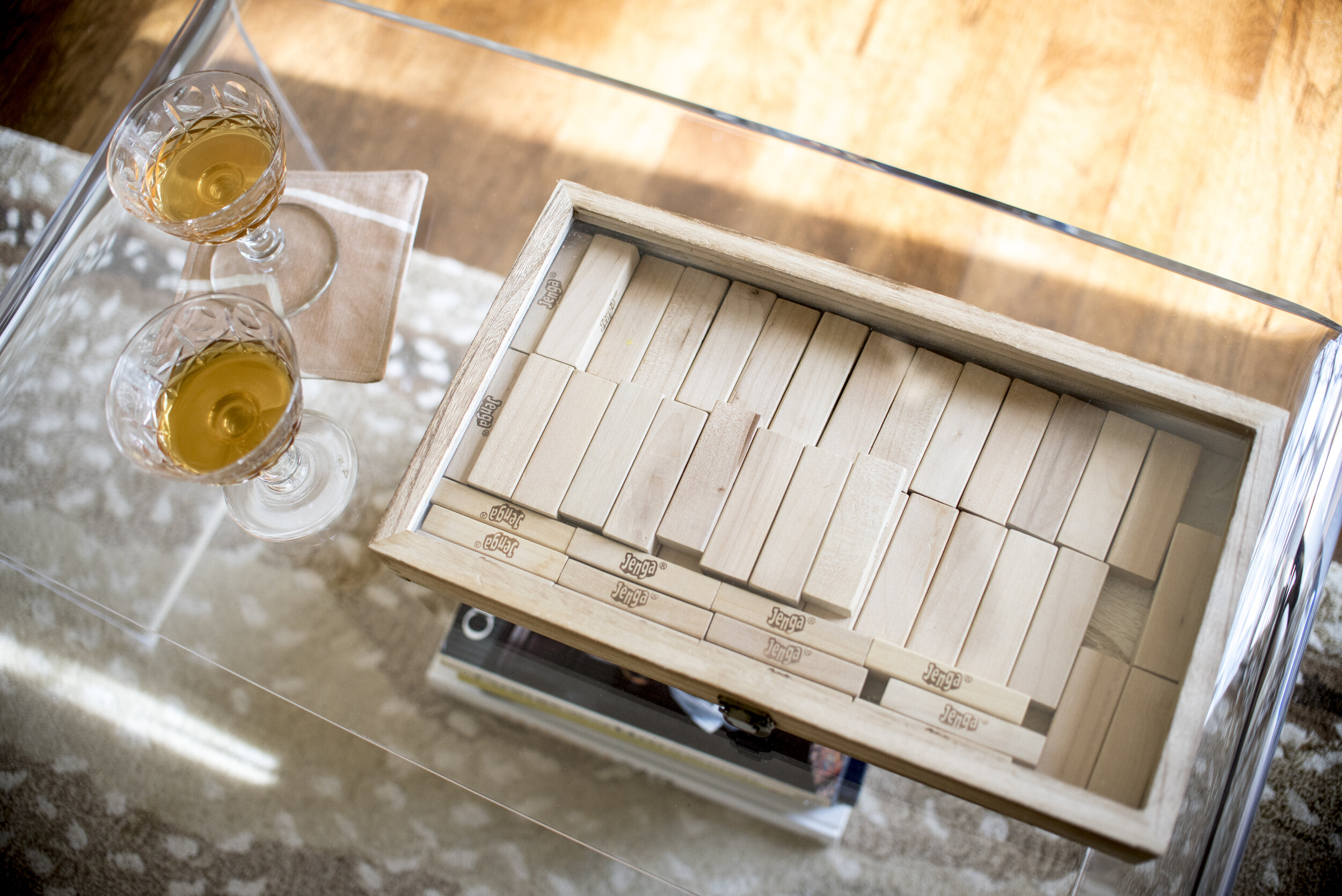
I always like to include a game in my airbnb designs. I had fun coming up with this fun way to display Jenga that looks modern and sleek. Because it has a glass top, it doesn’t interrupt the small surface area of the table - guests can set their phone or drink right on top of it when the lid is closed.
asheville airbnb
A bottle of wine is nice, but I encouraged my client to leave a crystal decanter of bourbon instead. This is such a handsome space - it deserved something extra special.
asheville airbnb
asheville airbnb
And there you have it! I’m so proud of this design and even more thrilled that my client is so pleased! If you are visiting the area, make sure to book your stay here!
asheville north carolina interior designer


